Branding & Styling
Make your docs unmistakably yours: colors, fonts, logos, brand templates, and custom CSS or JS, no code required.
This page covers how your docs look: colors, fonts, logos, custom CSS and JS, and one-click brand templates. To change how they are laid out, such as single-page versus paged navigation or page templates, see Themes & Templates.

General settings
- Logos: upload separate logos for light and dark modes; ideal dimensions are provided for crisp display.
- Favicon: customize the icon shown in browser tabs and bookmarks.
- Logo hyperlink: point your logo to any URL.
- Attribution (white-label): toggle the “Powered by Theneo” attribution on or off to fully white-label your documentation.
- Document font: choose from a variety of fonts for consistency.
Color customization
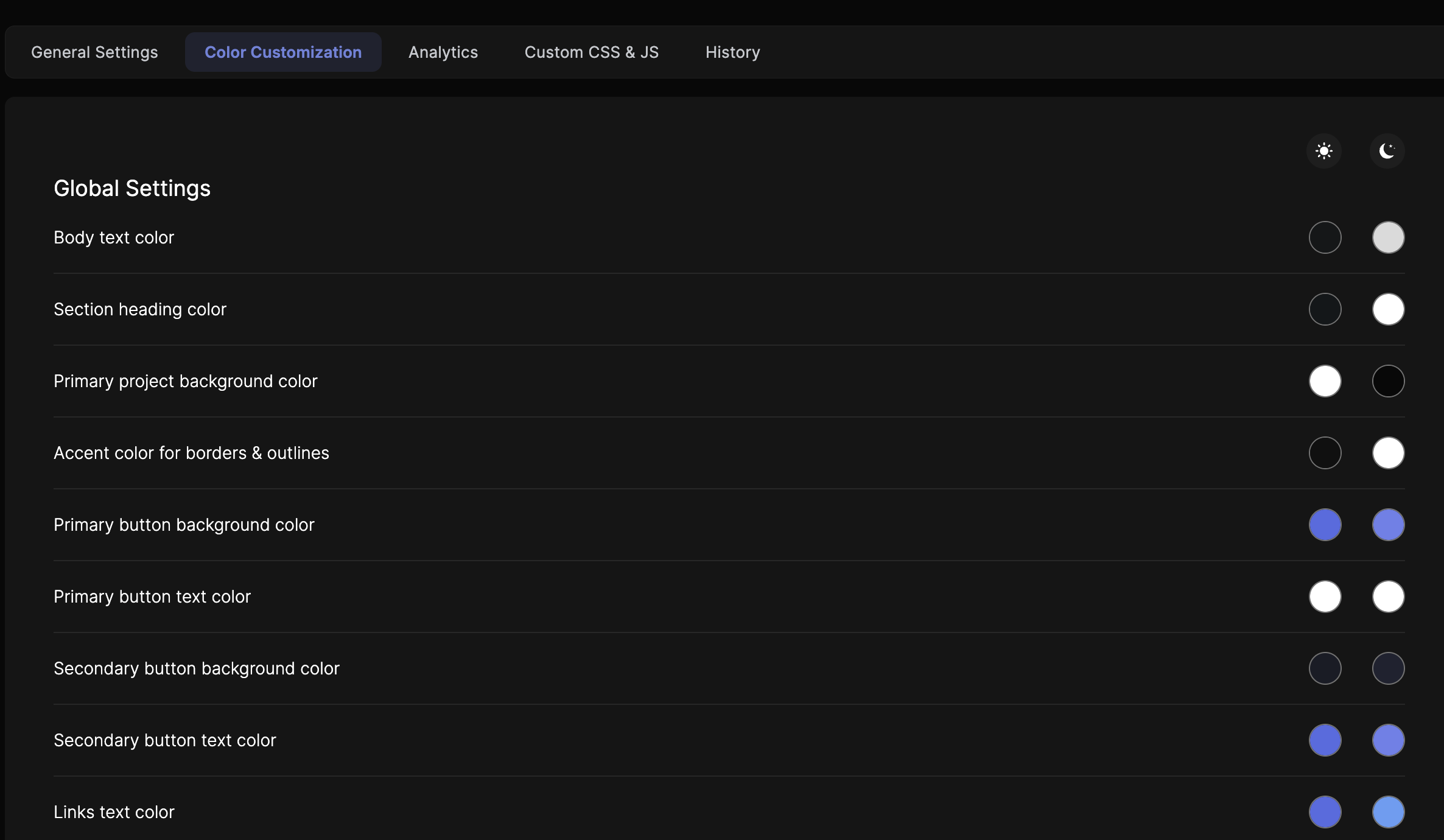
Color customization is available on Business and Growth tiers.
Adjust colors across every part of your published docs, in both light and dark modes:
Global Settings
Global Settings
- Body text: the main text color for readability against the background.
- Section headings: distinct colors for better navigation.
- Background: the primary backdrop color.
- Accents: borders and outlines.
- Buttons: background and text colors.
- Links: hyperlink text color.
Left Sidebar Menu
Left Sidebar Menu
- Item colors: individual items and the active selection.
- Background: a unified sidebar background color.
Content Cards
Content Cards
- Code snippets: header and body background colors.
- Base URL: the color scheme of Base URL card headers and bodies.
- General info: header and body background colors for info cards.
Feedback & Text Selection
Feedback & Text Selection
- Feedback button: make it stand out or blend in.
- Text selection: background and font colors for selected text.
API Explorer Buttons & Response Boxes
API Explorer Buttons & Response Boxes
- Buttons: colors that prompt interaction.
- Response boxes: property and value text colors for clear visibility.
Alerts
Alerts
Customize background, icon, text, and border colors for warning, primary, danger, and success panels, so each alert type is distinct and noticeable.
HEX code tip: in the color picker, double-click the RGB section to switch to HSL, where a HEX input appears, then paste your brand’s HEX codes directly for precise matching.
Custom CSS & JavaScript
Custom CSS and JS are available on the Growth tier.
1
Open Custom CSS & JS settings
Go to Branding in your dashboard and find the Custom CSS & JS section.
2
Add your CSS
Write or paste CSS for custom fonts, padding and margins, background images or gradients, animations, and responsive tweaks. Make sure it's well-formed to avoid display issues.
3
Add your JavaScript
Add JS for third-party scripts (analytics, live chat), custom interactions, dynamic content, or form handling. Test it to avoid conflicts with Theneo's existing scripts.
4
Save
Click Save and review your changes to confirm they produce the desired effect.
Connect any third-party tool. Because you can inject your own JavaScript, custom JS effectively enables integrations with almost any external service: analytics and product engagement like Google Analytics, Google Tag Manager, Amplitude, PostHog, Mixpanel, Segment, Hotjar, Heap, Plausible, FullStory, and support or live-chat tools like Intercom. If a tool ships a JavaScript snippet, it works with Theneo.
Custom font
Add any font using the Custom CSS feature:
1
Choose a font
- Visit Google Fonts or another trusted source.
- Select your font and copy its
@importURL. - Alternatively, use a Base64-encoded font to embed it without external links.
2
Add the font to your CSS
Use @import to link the font, then apply it with font-family (the * universal selector applies it everywhere):
   @import url('https://fonts.googleapis.com/css2?family=Roboto:ital,wght@0,400;0,700&family=Sofia&display=swap');

* {
  font-family: "Sofia", serif;
  font-weight: 400;
  font-style: normal;
}
3
Update your documentation
- Open Branding Configuration in the dashboard.
- Find the Custom CSS section.
- Paste your CSS and save.
Branding Template Selector
Apply a complete visual identity in a single click. Instead of configuring colors, CSS, and JS individually, choose one of three predefined templates: Solid, Bloom, or Roboto, and all branding fields populate automatically across your entire workspace.
Who can use it
Workspace Admin
Full access to Branding General Settings. Can select, apply, and override any template, and further customize fields afterward.
Workspace Editor
Can select and apply templates from General Settings. Changes apply workspace-wide, just like Admin-applied templates.
Viewers and project-level collaborators can’t access Branding General Settings and won’t see the Template Selector.
Available templates
Each template ships with a complete set of branding values: primary and background colors, custom CSS, and custom JS. Selecting one overwrites any previously configured values in all three fields. Check out available templates here.
Branding history & version revert
The History tab gives Admins and Editors a chronological log of every branding change across the workspace, including who made it, when, and the ability to roll back to any of the three most recent versions instantly.
Go to Settings → Branding → History. The History tab sits beside General and is visible to all Admins and Editors.
Viewers and project-level collaborators can’t access the Branding settings page and won’t see the History tab.
Frequently asked questions
Do you integrate with Intercom?
Do you integrate with Intercom?
Yes, through custom JavaScript. Paste your Intercom snippet into the Custom CSS & JS section in Branding, then save and republish. The same approach works for any other tool that provides a JavaScript snippet.


On this page
- Branding & Styling